Pretty Print Ideas || Photo Card How To
Senior Graduation Announcements & Invitations
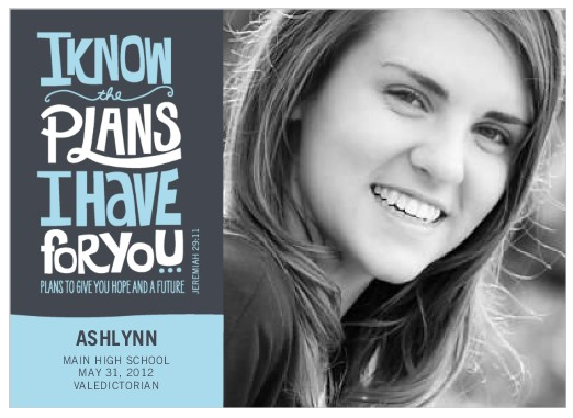
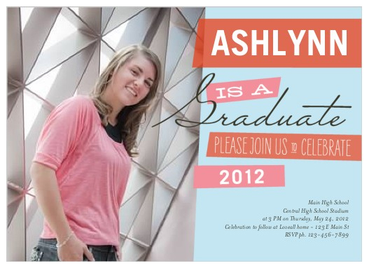
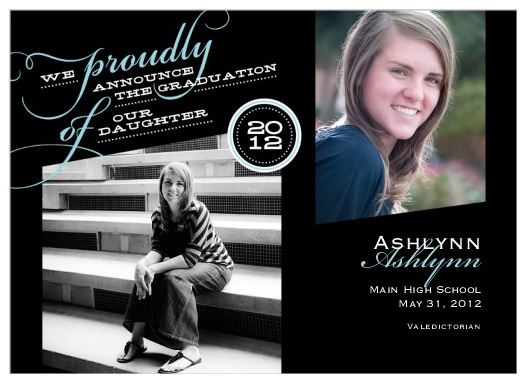
We recently shot a photo session with a very accomplished high school senior. The locations choosen were personal: we shot at ASU where she'll be attending next fall and the ball field was one she played at during her high school softball career. Though the wind made it feel like we were in Kansas (Toto where are you??) we managed to shoot quite a few photos!
When I sat down to throw a few sample cards together it was flash back to Christmas time! So many families (moms!) sit down to put a card together and at this time of year, there are families designing Senior Graducation Announcements and Invitations. I'm hoping this How To will be helpful the next time you are faced with a project! TLP does complimentary card designs for any session we shoot - we always enjoy playing with the photos and seeing them in beautiful print!
Tips for creating a photo card:
- Choose a color scheme - usually by pulling colors from the photo.
- If your photo session featured an instant favorite shot - one you want to show everyone! - don't feel pressure to throw a collage of 5 photos on a card just because you can! Showcase that showstopper with a single photo card. Just picture the impact of that one large photo on the refrigerator!
- If you like too many photos or want to show off several looks, choose a card template that is not fussy, busy, or too colorful. Let it be simple to avoid the hodge podge look.
- In a multi-photo layout, decide which photo is most important and choose the other photos to support or compliment that main photo. Don't make them compete or you'll minimize the WOW of the main photo.
- If using multiple photos - don't make them all close up mug shots. Variety is good! Mix a close up with a full length shot with a detail or mid-range shot.
- Skin tones change so much under different lighting conditions and with different editing techniques. Be wary of placing different tone photos side by side. The most impact would be to have one color photo near a black and white photo.
Final test - look closely at the design and ask the most important question! "How will this look on the refrigerator??"